
R for Data Science Exercises: Joining Data Frames
Joining data frames is a crucial data manipulation technique used to combine two or more data frames based on common columns or keys. This process allows you to merge datasets to create a more comprehensive and detailed dataset that can be used for further analysis.

R for Data Science 2nd Edition Exercises (Wickham, Mine Çetinkaya-Rundel and Grolemund, 2023)
Joining Data Frames
Run the code in your script for the answers! I'm just exploring as I go.
Packages to load
library(tidyverse)
library(gt)
library(gtExtras)
library(nycflights13)
library(janitor)
Introduction
What is Joining Data Frames?
Joining data frames is a crucial data manipulation technique used to combine two or more data frames based on common columns or keys. This process allows you to merge datasets to create a more comprehensive and detailed dataset that can be used for further analysis. In R, joining data frames is typically performed using functions from the dplyr package, which is part of the tidyverse suite of packages designed for data science.
Why Join Data Frames?
Joining data frames is essential for several reasons:
- Combining Related Data: Often, data relevant to an analysis is spread across multiple data frames. Joining allows you to integrate these pieces into a single dataset.
- Enriching Data: By merging datasets, you can enhance your data with additional attributes or variables that provide deeper insights.
- Data Cleaning and Preparation: Merging data frames can help in cleaning and organizing your data, making it easier to analyse.
- Efficiency: It simplifies the data processing workflow, reducing the need for multiple, separate data operations.
Joining Keys
Every join involves a pair of keys: a primary key and a foreign key. A primary key is a variable or set of variables that uniquely identifies each observation. When more than one variable is needed, the key is called a compound key. A foreign key is a variable or set of variables that reference the primary key in another data frame. The join operation matches the primary key in one data frame with the foreign key in another data frame. Surrogate keys are artificial primary keys created to uniquely identify observations when a natural key is not available or is not reliable. They are often used in database design to ensure data integrity and consistency.
Types of Joins
-
Mutating Joins: Add new variables to one data frame from another.
- Inner Join (
inner_join()): Retains only rows with matching keys in both data frames. - Left Join (
left_join()): Keeps all rows from the left data frame and adds matching rows from the right data frame. Non-matching rows in the right data frame result inNA. - Right Join (
right_join()): Keeps all rows from the right data frame and adds matching rows from the left data frame. Non-matching rows in the left data frame result inNA. - Full Join (
full_join()): Retains all rows from both data frames, filling inNAwhere there are no matches.
- Inner Join (
-
Filtering Joins: Filter one data frame against another.
- Semi Join (
semi_join()): Retains only the rows in the left data frame that have a match in the right data frame, without adding columns from the right data frame. - Anti Join (
anti_join()): Retains only the rows in the left data frame that do not have a match in the right data frame.
- Semi Join (
Handling Duplicate Keys
- One-to-Many Relationships: If one data frame has duplicate keys and the other does not, the join will duplicate the rows from the non-duplicated data frame.
- Many-to-Many Relationships: If both data frames have duplicate keys, the result will have the Cartesian product of the matching rows.
Common Problems and Solutions
-
Missing Keys: If a key is missing in one data frame,
NAwill be introduced in the resulting data frame. -
Conflicting Column Names: Use the suffixes argument to differentiate columns with the same name.
Join required
_join(df1, df2, by = "key", suffix = c(".df1", ".df2"))
Practical Tips
- Checking for Mismatches: Use
anti_join()to identify rows in one data frame without matches in another. - Cleaning Data Before Joins: Ensure that key columns are of the same type and have no leading/trailing spaces or case inconsistencies.
- Choosing the Right Join: Use
semi_join()andanti_join()to filter data frames before performing mutating joins to control the size and contents of the final data frame.
Example Workflow
- Prepare Data: Clean and standardize the key columns in both data frames.
- Choose the Appropriate Join: Select the join type based on the analysis goal (e.g., combining data, filtering rows).
- Perform the Join: Use the appropriate
dplyrfunction to join the data frames. - Inspect the Result: Check the resulting data frame for expected structure and completeness.
Example Code
library(dplyr)

# Example data frames
students <- data.frame(
  student_id = c(1, 2, 3, 4),
  student_name = c("Alice", "Bob", "Charlie", "David")
)

grades <- data.frame(
  student_id = c(2, 3, 4, 5),
  grade = c("A", "B", "C", "D")
)

# Perform an inner join
result_inner <- inner_join(students, grades, by = "student_id")
print(result_inner)

# Perform a left join
result_left <- left_join(students, grades, by = "student_id")
print(result_left)

# Perform a full join
result_full <- full_join(students, grades, by = "student_id")
print(result_full)

# Perform a semi join
result_semi <- semi_join(students, grades, by = "student_id")
print(result_semi)

# Perform an anti join
result_anti <- anti_join(students, grades, by = "student_id")
print(result_anti)
Joining data frames in R is a fundamental operation for data manipulation and preparation. By understanding and utilizing the different types of joins provided by the dplyr package, you can efficiently merge datasets to suit your analytical needs. This process not only helps in integrating and enriching your data but also simplifies your data analysis workflow.
Keys
Questions
-
We forgot to draw the relationship between
weatherandairportsin Figure 19.1.
What is the relationship and how should it appear in the diagram? -
weatheronly contains information for the three origin airports in NYC.
If it contained weather records for all airports in the USA, what additional connection would it make toflights? -
The
year,month,day,hour, andoriginvariables almost form a compound key forweather, but there's one hour that has duplicate observations.
Can you figure out what's special about that hour? -
We know that some days of the year are special and fewer people than usual fly on them (e.g., Christmas eve and Christmas day).
How might you represent that data as a data frame?
What would be the primary key?
How would it connect to the existing data frames? -
Draw a diagram illustrating the connections between the
Batting,People, andSalariesdata frames in the Lahman package.
Draw another diagram that shows the relationship betweenPeople,Managers,AwardsManagers.
How would you characterize the relationship between theBatting,Pitching, andFieldingdata frames?
Answers
Solution 1:
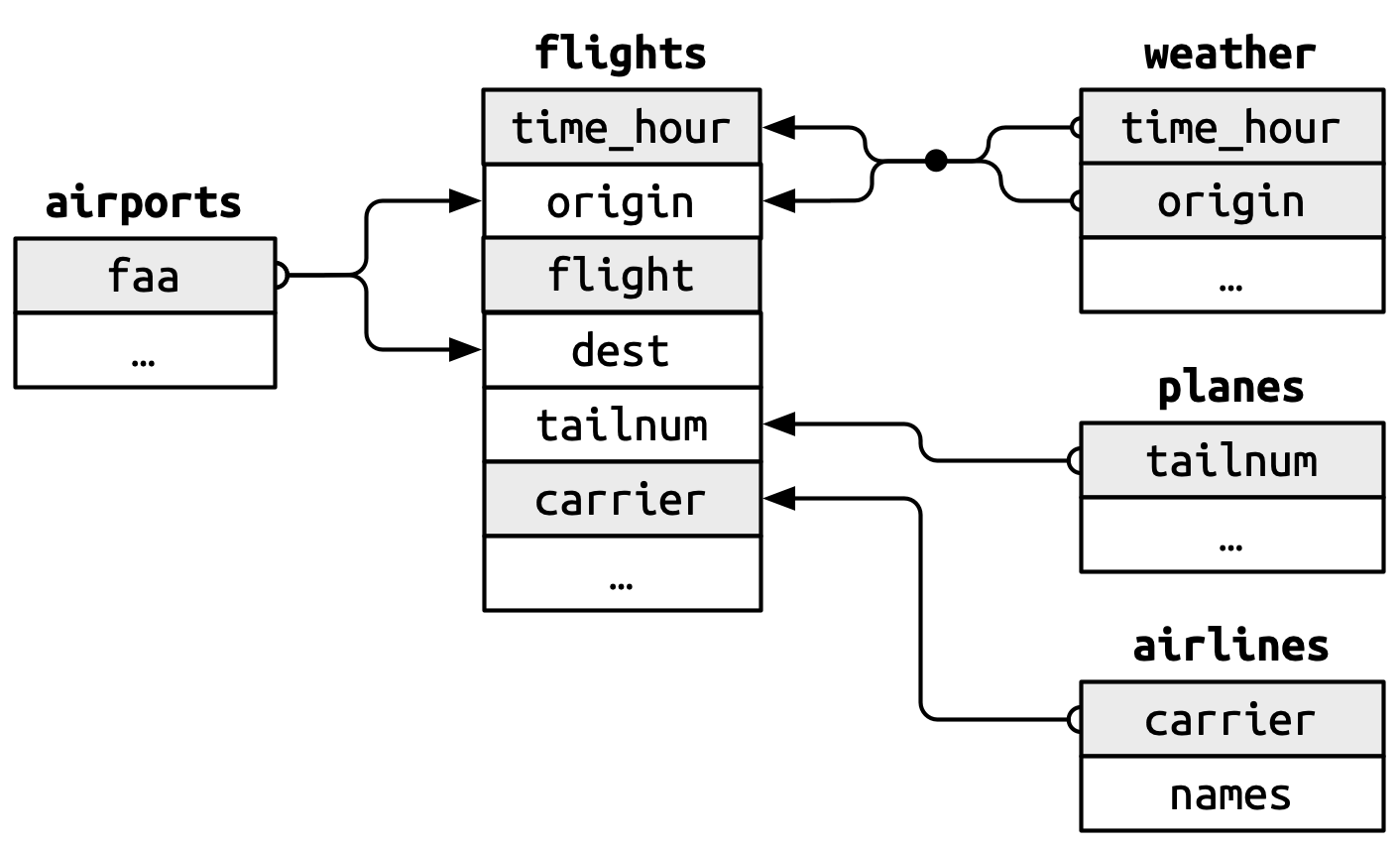
The relation between weather and airports is depicted below in the image adapted and copied from R for Data Science 2(e), Fig 19.1.
-
The primary key will be
airports$faa. -
It corresponds to a compound secondary key,
weather$originandweather$time_hour.
 {width="339"}
Solution 2:
If weather contained the weather records for all airports in the USA, it would have made an additional connection to the variable dest in the flights dataset.
Solution 3:
As we can see in the @tbl-q3-ex2 , on November 3, 2013 at 1 am, we have a duplicate weather record. This means that the combination of year, month, day, hour, and origin variables does not form a compound key for weather , since some observations are not unique.
This happens because the daylight savings time clock changed on November 3, 2013 in New York City as follows:
-
Start of DST in 2013: Sunday, March 10, 2013 -- 1 hour forward - 1 hour is skipped.
-
End of DST in 2013: Sunday, November 3, 2013 -- 1 hour backward at 1 am.
#| label: tbl-q3-ex2
#| tbl-cap: "Day and hour that has two weather reports"

weather |>
  group_by(year, month, day, hour, origin) |>
  count() |>
  filter(n > 1) |>
  ungroup() |>
  gt() |>
  gt_theme_538()
Solution 4:
We can create a data frame or a tibble, as shown in the code below, named holidays to represent holidays and the pre-holiday days.
The primary key would be a compound key of year , month and day. It would connect to the existing data frames using a secondary compound key of of year , month and day.
[Note: to make things easier, without using a compound key, I have used the make_date() function to create a single key flight_date() ]
#| code-fold: true


# Create a tibble for the major holidays in the USA in 2013
holidays <- tibble(
  year = 2013,
  month = c(1, 2, 5, 7, 9, 10, 11, 12),
  day = c(1, 14, 27, 4, 2, 31, 28, 25),
  holiday_name = c(
    "New Year's Day",
    "Valentine's Day",
    "Memorial Day",
    "Independence Day",
    "Labor Day",
    "Halloween",
    "Thanksgiving",
    "Christmas Day"
  ),
  holiday_type = "Holiday"
)

# Computing the pre-holiday date and adding it to holidays
holidays <- bind_rows(
  # Exisitng tibble of holidays
  holidays,
  # A new tibble of holiday eves
  holidays |>
  mutate(
    day = day-1,
    holiday_name = str_c(holiday_name, " Eve"),
    holiday_type = "Pre-Holiday"
  ) |>
  slice(2:8)
) |>
  mutate(flight_date = make_date(year, month, day))

# Display
holidays |>
  gt() |>
  # cols_label_with(fn = ~ make_clean_names(., case = "title")) |>
  gt_theme_nytimes()
Now, we can use this new tibble, join it with our existing data sets and try to figure out whether there is any difference in number of flights on holidays, and pre-holidays, vs. the rest of the days. The results are in @fig-q4-ex2-a.
#| code-fold: true
#| label: fig-q4-ex2-a
#| fig-cap: "Average number of flights on holidays vs pre-holidays vs rest of the days"

# A tibble on the number of flights each day, along with whether each day
# is holiday or not; and if yes, which holiday
nos_flights <- flights |>
  mutate(flight_date = make_date(year, month, day)) |>
  left_join(holidays) |>
  group_by(flight_date, holiday_type, holiday_name) |>
  count()

nos_flights |>
  group_by(holiday_type) |>
  summarize(avg_flights = mean(n)) |>
  mutate(holiday_type = if_else(is.na(holiday_type),
                                "Other Days",
                                holiday_type)) |>
  ggplot(aes(x = avg_flights,
             y = reorder(holiday_type, avg_flights))) +
  geom_bar(stat = "identity", fill = "grey") +
  theme_minimal() +
  theme(panel.grid = element_blank()) +
  labs(y = NULL, x = "Average Number of flights (per day)",
       title = "Holidays / pre-holiday have lower number of flights, on average") +
  theme(plot.title.position = "plot")
The number of flights on various holidays and pre-holiday days is shown in @fig-q4-ex2-b.
#| label: fig-q4-ex2-b
#| fig-cap: "Average number of flights on some important days vs others"
#| code-fold: true
nos_flights |>
  group_by(holiday_name) |>
  summarize(avg_flights = mean(n)) |>
  mutate(holiday_name = if_else(is.na(holiday_name),
                                "Other Days",
                                holiday_name)) |>
  mutate(col_var = holiday_name == "Other Days") |>
  ggplot(aes(x = avg_flights,
             y = reorder(holiday_name, avg_flights),
             fill = col_var,
             label = round(avg_flights, 0))) +
  geom_bar(stat = "identity") +
  geom_text(nudge_x = 20, size = 3) +
  theme_minimal() +
  theme(panel.grid = element_blank(),
        plot.title.position = "plot",
        legend.position = "none") +
  labs(y = NULL, x = "Number of flights (per day)") +
  scale_fill_brewer(palette = "Paired") +
  coord_cartesian(xlim = c(500, 1050))
Solution 5:
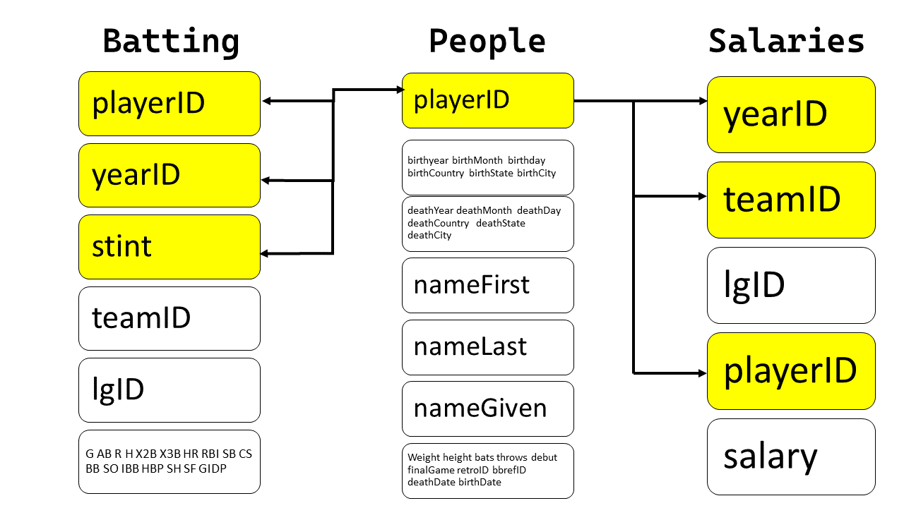
The data-frames are shown below, alongwith the check that playerID is a key:
In Batting , the variables playerID , yearID and stint form a compound key.
library(Lahman)
Batting |> as_tibble() |>
  group_by(playerID, yearID, stint) |>
  count() |>
  filter(n > 1)
head(Batting) |> tibble() |>
  gt() |> gt_theme_538() |>
   tab_style(
    style = list(cell_fill(color = "grey"),
                 cell_text(weight = "bold")),
    locations = cells_body(columns = c(playerID, yearID, stint))
  ) |>
  tab_header(title = md("**`Batting`**"))
In People, the variable playerID is unique for each observation, and hence a primary key.
People |>
  as_tibble() |>
  group_by(playerID) |>
  count() |>
  filter(n > 1)

head(People) |> tibble() |>
  gt() |> gt_theme_538() |>
   tab_style(
    style = list(cell_fill(color = "grey"),
                 cell_text(weight = "bold")),
    locations = cells_body(columns = c(playerID))
  ) |>
  tab_header(title = md("**`People`**"))
In Salaries the variables playerID , yearID and stint form a compound key.
Salaries |>
  as_tibble() |>
  group_by(playerID, yearID, teamID) |>
  count() |>
  filter(n > 1)

head(Salaries) |> tibble() |>
  gt() |> gt_theme_538() |>
   tab_style(
    style = list(cell_fill(color = "grey"),
                 cell_text(weight = "bold")),
    locations = cells_body(columns = c(playerID, yearID, teamID))
  )|>
  tab_header(title = md("**`Salaries`**"))
The diagram illustrating the connections is shown below:
 {width="400"}
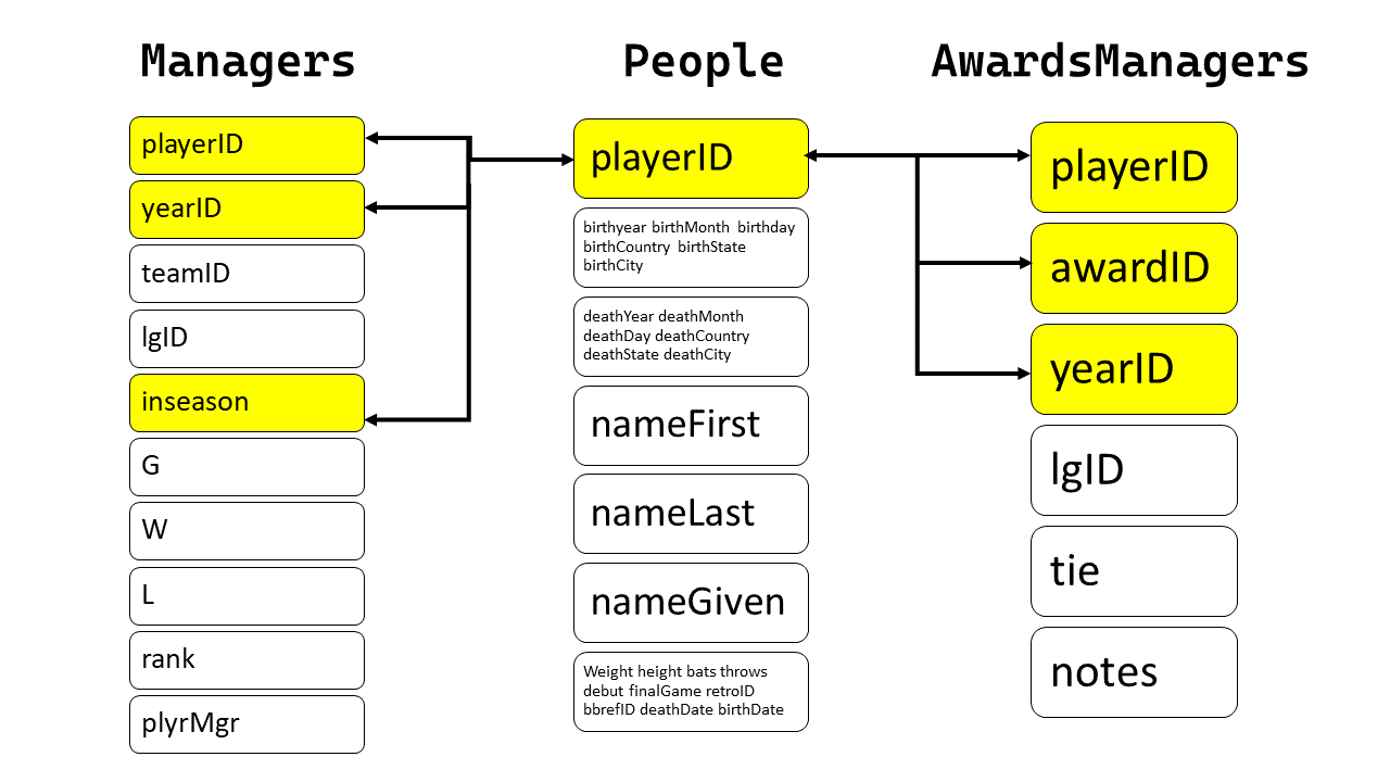
Now, we show another diagram that shows the relationship between People, Managers, AwardsManagers.
For Managers, the key is a compound key of playerID, yearID and inseason
head(Managers)
Managers |>
  as_tibble() |>
  group_by(playerID, yearID, inseason) |>
  count() |>
  filter(n > 1)

head(Managers) |> as_tibble() |>
  gt() |>
  gt_theme_538() |>
  tab_style(
    style = list(cell_fill(color = "grey"),
                 cell_text(weight = "bold")),
    locations = cells_body(columns = c(playerID, yearID, inseason))
  ) |>
  tab_header(title = md("**`Managers`**"))
For AwardsManagers , the primary key is a compound key of playerID , awardID and yearID.
head(AwardsManagers)

AwardsManagers |>
  as_tibble() |>
  group_by(playerID, awardID, yearID) |>
  count() |>
  filter(n > 1)

head(AwardsManagers) |> as_tibble() |>
  gt() |>
  gt_theme_538() |>
  tab_style(
    style = list(cell_fill(color = "grey"),
                 cell_text(weight = "bold")),
    locations = cells_body(columns = c(playerID, yearID, awardID))
  ) |>
  tab_header(title = md("**`AwardsManagers`**"))
Hence, the relationship between People, Managers, AwardsManagers is as follows:
 {width="400"}
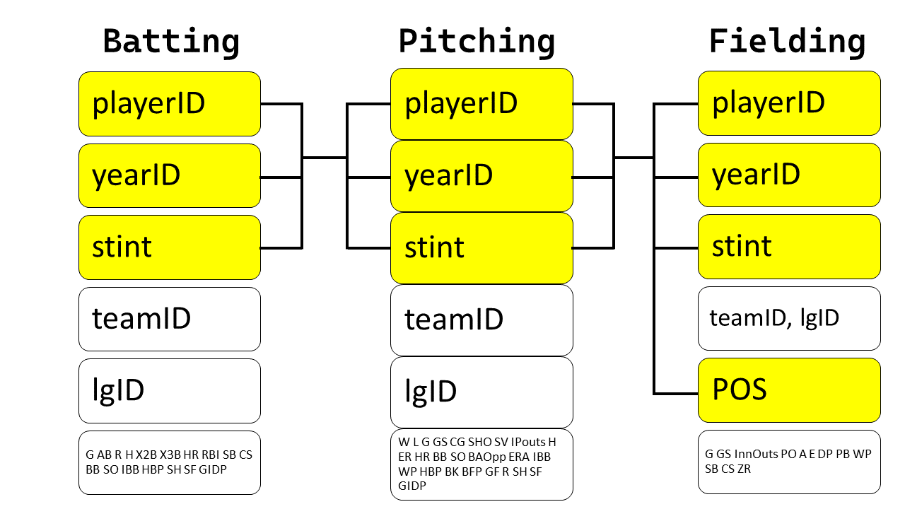
Now, let's try to characterize the relationship between Batting , Pitching and Fielding.
Pitching |> as_tibble() |>
  group_by(playerID, yearID, stint) |>
  count() |>
  filter(n > 1)

head(Pitching) |> as_tibble() |>
  gt() |>
  gt_theme_538() |>
  tab_style(
    style = list(cell_fill(color = "grey"),
                 cell_text(weight = "bold")),
    locations = cells_body(columns = c(playerID, yearID, stint))
  ) |>
  tab_header(title = md("**`Pitching`**"))
In the Fielding dataset, the primary key is a compound key comprised of playerID , yearID , stint and POS.
Fielding |> as_tibble() |>
  group_by(playerID, yearID, stint, POS) |>
  count() |>
  filter(n > 1)

head(Fielding) |> as_tibble() |>
  gt() |>
  gt_theme_538() |>
  tab_style(
    style = list(cell_fill(color = "grey"),
                 cell_text(weight = "bold")),
    locations = cells_body(columns = c(playerID, yearID, stint, POS))
  ) |>
  tab_header(title = md("**`Fielding`**"))
Thus, the relationship between the Batting, Pitching, and Fielding data frames is as follows:
 {width="400"}
Basic Joins
Questions
-
Find the 48 hours (over the course of the whole year) that have the worst delays.
Cross-reference it with theweatherdata.
Can you see any patterns? -
Imagine you've found the top 10 most popular destinations using this code:
# Prerequisite code
flights2 <- flights |>
  mutate(id = row_number(),.before = 1)
top_dest <- flights2 |>
  count(dest, sort = TRUE) |>
  head(10)
top_dest_vec <- top_dest |> select(dest) |> as_vector()

flights |>
  filter(dest %in% top_dest_vec)

top_dest <- flights2 |>
  count(dest, sort = TRUE) |>
  head(10)
How can you find all flights to those destinations?
-
Does every departing flight have corresponding weather data for that hour?
-
What do the tail numbers that don't have a matching record in
planeshave in common?
(Hint: one variable explains ~90% of the problems.) -
Add a column to
planesthat lists everycarrierthat has flown that plane.
You might expect that there's an implicit relationship between plane and airline, because each plane is flown by a single airline.
Confirm or reject this hypothesis using the tools you've learned in previous chapters. -
Add the latitude and the longitude of the origin and destination airport to
flights.
Is it easier to rename the columns before or after the join? -
Compute the average delay by destination, then join on the
airportsdata frame so you can show the spatial distribution of delays.
Here's an easy way to draw a map of the United States:#| eval: false airports |> semi_join(flights, join_by(faa == dest)) |> ggplot(aes(x = lon, y = lat)) + borders("state") + geom_point() + coord_quickmap()You might want to use the
sizeorcolorof the points to display the average delay for each airport. -
What happened on June 13 2013?
Draw a map of the delays, and then use Google to cross-reference with the weather.#| eval: false #| include: false worst <- filter(flights, !is.na(dep_time), month == 6, day == 13) worst |> group_by(dest) |> summarize(delay = mean(arr_delay), n = n()) |> filter(n > 5) |> inner_join(airports, join_by(dest == faa)) |> ggplot(aes(x = lon, y = lat)) + borders("state") + geom_point(aes(size = n, color = delay)) + coord_quickmap()
Answers
Solution 1:
First, we find out the 48 hours (over the course of the whole year) that have the worst delays. As we can see in @fig-q1-ex3-dist , these are quite similar across the 3 origin airports, for which we have the weather data.
#| code-fold: true
#| label: fig-q1-ex3-dist
#| fig-cap: "Distribution of the 48 worst delay hours over the course of the year in three airports of New York City"
# Create a dataframe of 48 hours with highestaverage delays
# (for each of the 3 origin airports)
delayhours = flights |>
  group_by(origin, time_hour) |>
  summarize(avg_delay = mean(dep_delay, na.rm = TRUE)) |>
  arrange(desc(avg_delay),.by_group = TRUE) |>
  slice_head(n = 48) |>
  arrange(time_hour)

delayhours |>
  ggplot(aes(y = time_hour, x = avg_delay)) +
  geom_point(size = 2, alpha = 0.5) +
  facet_wrap(~origin, dir = "h") +
  theme_minimal() +
  labs(x = "Average delay during the hour (in mins.)", y = NULL,
       title = "The worst 48 hours for departure delays are similar across 3 airports")
The @fig-q1-ex3-multi depicts that across the three airports, the 48 hours with worst delays consistently have much higher rainfall (precipitation in inches) and poorer visibility (lower visibility in miles and higher dew-point in degrees F).
#| code-fold: true
#| label: fig-q1-ex3-multi
#| fig-cap: "Comparison of weather patterns for hours with worst delays vs the rest"
#| fig-width: 10

var_labels = c("Temperature (F)", "Dewpoint (F)",
               "Relative Humidity %", "Precipitation (inches)",
               "Visibility (miles)")
names(var_labels) = c("temp", "dewp", "humid", "precip", "visib")

g1 = weather |>
  filter(origin == "EWR") |>
  left_join(delayhours) |>
  mutate(
    del_hrs = if_else(is.na(avg_delay),
                      "Other hours",
                      "Hours with max delays"),
    precip = precip * 25.4
  ) |>
  pivot_longer(
    cols = c(temp, dewp, humid, precip, visib),
    names_to = "variable",
    values_to = "values"
  ) |>
  group_by(origin, del_hrs, variable) |>
  summarise(means = mean(values, na.rm = TRUE)) |>
  ggplot(aes(x = del_hrs, y = means, fill = del_hrs)) +
  geom_bar(stat = "identity") +
  facet_wrap( ~ variable, scales = "free", ncol = 5,
              labeller = labeller(variable = var_labels)) +
  scale_fill_brewer(palette = "Dark2") +
  theme_minimal() +
  theme(panel.grid.major.x = element_blank(),
        axis.title = element_blank(),
        axis.text.x = element_blank(),
        legend.position = "bottom") +
  labs(subtitle = "Weather Patterns for Newark Airport (EWR)",
       fill = "")

g2 = weather |>
  filter(origin == "JFK") |>
  left_join(delayhours) |>
  mutate(
    del_hrs = if_else(is.na(avg_delay),
                      "Other hours",
                      "Hours with max delays"),
    precip = precip * 25.4
  ) |>
  pivot_longer(
    cols = c(temp, dewp, humid, precip, visib),
    names_to = "variable",
    values_to = "values"
  ) |>
  group_by(origin, del_hrs, variable) |>
  summarise(means = mean(values, na.rm = TRUE)) |>
  ggplot(aes(x = del_hrs, y = means, fill = del_hrs)) +
  geom_bar(stat = "identity") +
  facet_wrap( ~ variable, scales = "free", ncol = 5,
              labeller = labeller(variable = var_labels)) +
  scale_fill_brewer(palette = "Dark2") +
  theme_minimal() +
  theme(panel.grid.major.x = element_blank(),
        axis.title = element_blank(),
        axis.text.x = element_blank(),
        legend.position = "bottom")  +
  labs(subtitle = "Weather Patterns for John F Kennedy Airport (JFK)",
       fill = "")

g3 = weather |>
  filter(origin == "LGA") |>
  left_join(delayhours) |>
  mutate(
    del_hrs = if_else(is.na(avg_delay),
                      "Other hours",
                      "Hours with max delays"),
    precip = precip * 25.4
  ) |>
  pivot_longer(
    cols = c(temp, dewp, humid, precip, visib),
    names_to = "variable",
    values_to = "values"
  ) |>
  group_by(origin, del_hrs, variable) |>
  summarise(means = mean(values, na.rm = TRUE)) |>
  ggplot(aes(x = del_hrs, y = means, fill = del_hrs)) +
  geom_bar(stat = "identity") +
  facet_wrap( ~ variable, scales = "free", ncol = 5,
              labeller = labeller(variable = var_labels)) +
  scale_fill_brewer(palette = "Dark2") +
  theme_minimal() +
  theme(panel.grid.major.x = element_blank(),
        axis.title = element_blank(),
        axis.text.x = element_blank(),
        legend.position = "bottom")  +
  labs(subtitle = "Weather Patterns for La Guardia Airport (LGA)",
       fill = "")

library(patchwork)

g1 / g2 / g3 + plot_layout(guides = "collect") & theme(legend.position = "bottom")
Solution 2:
We can first create a vector of the names of the top 10 destinations, using select(dest) and as_vector(). Thereafter, we can filter(dest %in% top_dest_vec) as shown below:
flights2 <- flights |>
  mutate(id = row_number(),.before = 1)
top_dest <- flights2 |>
  count(dest, sort = TRUE) |>
  head(10)
top_dest_vec <- top_dest |> select(dest) |> as_vector()
flights |>
  filter(dest %in% top_dest_vec)
Solution 3:
No, as we can see from the code below, every departing flight DOES NOT have corresponding weather data for that hour. 1556 flights do not have associated weather data; and these correspond to 38 different hours during the year.
# Number of flights that do not have associated weather data
flights |>
  anti_join(weather) |>
  nrow()

# Number of distinct time_hours that do not have such data
flights |>
  anti_join(weather) |>
  distinct(time_hour)

# A check to confirm our results
flights |>
  select(year, month, day, origin, dest, time_hour) |>
  left_join(weather) |>
  summarise(
    missing_temp_or_windspeed = mean(is.na(temp) & is.na(wind_speed)),
    missing_dewp = mean(is.na(dewp))
  )
(as.numeric(flights |> anti_join(weather) |> nrow())) / nrow(flights)
Solution 4:
The tail numbers that don't have a matching record in planes mostly belong the a select few airline carriers, i.e., AA and MQ . The variable carrier explains most of the problems in missing data, as shown in @fig-q4-ex3.
#| label: fig-q4-ex3
#| fig-cap: "Bar Chart of number of flights per carrier"
#| code-fold: true

# Create a unique flight ID for each flight
flights2 <- flights |>
  mutate(id = row_number(), .before = 1)

ids_no_record = flights2 |>
  anti_join(planes, by = join_by(tailnum)) |>
  select(id) |>
  as_vector() |> unname()

flights2 = flights2 |>
  mutate(
    missing_record = id %in% ids_no_record
  )

label_vec = c("Flights with missing tailnum in planes", "Other flights")
names(label_vec) = c(FALSE, TRUE)

flights2 |>
  group_by(missing_record) |>
  count(carrier) |>
  mutate(col_var = carrier %in% c("MQ", "AA")) |>
  ggplot(aes(x = n, y = carrier, fill = col_var)) +
  geom_bar(stat = "identity") +
  facet_wrap(~ missing_record,
             scales = "free_x",
             labeller = labeller(missing_record = label_vec)) +
  theme_bw() +
  theme(legend.position = "none") +
  labs(x = "Number of flights",  y = "Carrier",
       title = "Flights with missing tailnum in planes belong to a select few carriers") +
  scale_fill_brewer(palette = "Set2")
Solution 5:
Using the code below, we confirm that there are 17 such different airplanes (identified by tailnum) that have been flown by two carriers. These are shown in @fig-q5-ex3-1 .
#| label: fig-q5-ex3-1
#| code-fold: true
#| tbl-cap: "Tail numbers which ahve been flown by more than one carrier"
#| tbl-cap-location: top


# Displaying tail numbers which have been used by more than one carriers
flights |>
  group_by(tailnum) |>
  summarise(number_of_carriers = n_distinct(carrier)) |>
  filter(number_of_carriers > 1) |>
  drop_na() |>
  gt() |>
  opt_interactive(page_size_default = 5,
                  use_highlight = TRUE,
                  pagination_type = "simple") |>
  cols_label_with(fn = ~ janitor::make_clean_names(., case = "title"))
The following code adds a column to planes that lists every carrier that has flown that plane.
# A tibble that lists all carriers a tailnum has flown
all_carrs = flights |>
  group_by(tailnum) |>
  distinct(carrier) |>
  summarise(carriers = paste0(carrier, collapse = ", ")) |>
  arrange(desc(str_length(carriers)))
# Display the tibble
slice_head(all_carrs, n= 30) |>
   gt() |> opt_interactive(page_size_default = 5)

# Merge with planes
planes |>
  left_join(all_carrs)
Solution 6:
The code shown below adds the latitude and the longitude of the origin and destination airport to flights. As we can see, it easier to rename the columns after the join, so that we the same airport might (though not in this case) may be used as origin and/or dest. Further, the use of rename() after the join allows us to write the code in flow.
flights |>
  left_join(airports, by = join_by(dest == faa)) |>
  rename(
    "dest_lat" = lat,
    "dest_lon" = lon
  ) |>
  left_join(airports, by = join_by(origin == faa)) |>
  rename(
    "origin_lat" = lat,
    "origin_lon" = lon
  ) |>
  relocate(origin, origin_lat, origin_lon,
           dest, dest_lat, dest_lon,
           .before = 1)
Solution 7:
The following code and the resulting @fig-map-q7-ex3 displays the result. I would like to avoid using size as an aesthetic, as it is not easy to compare on a continuous scale, and leads to visually tough comparison. Instead, I prefer to use an interactive visualization shown further below.
#| label: fig-map-q7-ex3
#| fig-asp: 1
#| fig-cap: "Airport destinations from New York City, with average arrival delays"

# Create a dataframe of 1 row for origin airports
or_apts = airports |>
  filter(faa %in% c("EWR", "JFK", "LGA")) |>
  select(-c(alt, tz, dst, tzone)) |>
  rename(dest = faa) |>
  mutate(type = "New York City",
         avg_delay = 0)

# Start with the flights data-set
flights |>

  # Compute average delay for each location
  group_by(dest) |>
  summarise(avg_delay = mean(arr_delay, na.rm = TRUE)) |>

  # Add the latitude and longitude data
  left_join(airports, join_by(dest == faa)) |>
  select(-c(alt, tz, dst, tzone)) |>
  mutate(type = "Destinations") |>

  # Add a row for origin airports data
  bind_rows(or_apts) |>

  # Plot the map and points
  ggplot(aes(x = lon, y = lat,
             col = avg_delay,
             shape = type,
             label = name)) +
  borders("state", colour = "white", fill = "lightgrey") +
  geom_point(size = 2) +
  coord_quickmap(xlim = c(-130, -65),
                 ylim = c(23, 50)) +
  scale_color_viridis_c(option = "C") +
  labs(col = "Average Delay at Arrival (mins.)", shape = "") +

  # Themes and Customization
  theme_void() +
  theme(legend.position = "bottom")
An interactive map to see average arrival delays:
<iframe title="" aria-label="Map" id="datawrapper-chart-URZO0" src="https://datawrapper.dwcdn.net/URZO0/1/" scrolling="no" frameborder="0" style="width: 0; min-width: 100% !important; border: none;" height="410" data-external="1"></iframe><script type="text/javascript">!function(){"use strict";window.addEventListener("message",(function(a){if(void 0!==a.data["datawrapper-height"]){var e=document.querySelectorAll("iframe");for(var t in a.data["datawrapper-height"])for(var r=0;r<e.length;r++)if(e[r].contentWindow===a.source){var i=a.data["datawrapper-height"][t]+"px";e[r].style.height=i}}}))}();
</script>
#| eval: false
#| echo: false

or_apts = airports |>
  filter(faa %in% c("EWR", "JFK", "LGA")) |>
  select(-c(alt, tz, dst, tzone)) |>
  rename(dest = faa) |>
  mutate(type = "New York City",
         avg_delay = 0)

# Start with the flights data-set
flights |>

  # Compute average delay for each location
  group_by(dest) |>
  summarise(avg_delay = mean(arr_delay, na.rm = TRUE)) |>

  # Add the latitude and longitude data
  left_join(airports, join_by(dest == faa)) |>
  select(-c(alt, tz, dst, tzone)) |>
  mutate(type = "Destinations") |>

  # Add a row for origin airports data
  bind_rows(or_apts) |>
  write_csv("temp-us-map.csv")
Solution 8:
In the map shown in figure @fig-map-q8-ex3 , we see abnormally large delays for all destinations than normal.
#| code-fold: true
flights |>
  mutate(Date = if_else((month == 6 & day == 13),
                       "June 13, 2013",
                       "Rest of the year")) |>
  group_by(Date) |>
  summarise(average_departure_delay = mean(dep_delay, na.rm = TRUE)) |>
  gt() |>
  cols_label_with(fn = ~ janitor::make_clean_names(., case = "title")) |>
  fmt_number(columns = average_departure_delay) |>
  gt_theme_538()
Further, when we search the weather on internet using google, we find that a major storm system had hit New York City on June 13, 2013. Thus, the departure delays are expected. The links to the weather reports are here, and in an article on severe flight cancellations and delays.
#| label: fig-map-q8-ex3
#| fig-cap: "Flight delays on June 13, 2013 for flights originating in New York City"
#| fig-cap-location: top

# Start with the flights data-set for June 13, 2013
flights |>
  filter(month == 6 & day == 13) |>
  # Compute average delay for each location
  group_by(dest) |>
  summarise(avg_delay = mean(arr_delay, na.rm = TRUE)) |>

  # Add the latitude and longitude data
  left_join(airports, join_by(dest == faa)) |>
  select(-c(alt, tz, dst, tzone)) |>

  # Plot the map and points
  ggplot(aes(x = lon, y = lat,
             col = avg_delay,
             label = name)) +
  borders("state", colour = "white", fill = "lightgrey") +
  geom_point(size = 3) +
  coord_quickmap(xlim = c(-130, -65),
                 ylim = c(23, 50)) +
  scale_color_viridis_c(option = "C") +
  labs(col = "Average Delay at Arrival (mins.)", shape = "",
       title = "Flight delays on June 13, 2013 re much higher than normal") +

  # Themes and Customization
  theme_void() +
  theme(legend.position = "bottom")
Non-Equi Joins
Questions
-
Can you explain what's happening with the keys in this equi join?
Why are they different?# x |> full_join(y, join_by(key == key)) # x |> full_join(y, join_by(key == key), keep = TRUE) -
When finding if any party period overlapped with another party period we used
q < qin thejoin_by()?
Why?
What happens if you remove this inequality?
Answers
Solution 1:
The code below shows the difference between the two joins. The first join is an equi-join, and the second join is a non-equi join. The first join will return all rows from x and y where the key values are equal. The second join will return all rows from x and y where the key values are equal, and also all rows from x and y where the key values are not equal.
#| code-fold: true
#| label: tbl-q1-ex3
#| tbl-cap: "Data frames x and y for the join"
#| tbl-cap-location: top
#| tbl-source: "R for Data Science 2(e)"
#| tbl-source-url: "https://r4ds.had.co.nz/relational-data.html"
#| tbl-source-licence: "CC BY-NC-ND 3.0 US"
#| tbl-source-licence-url: "https://creativecommons.org/licenses/by-nc-nd/3.0/us/"

x <- tribble(
  ~key, ~x_val,
  1, "x1",
  2, "x2",
  3, "x3"
)

y <- tribble(
  ~key, ~y_val,
  1, "y1",
  2, "y2",
  4, "y3"
)
# Equi join
x |> full_join(y, join_by(key == key))

# Non-equi join
x |> full_join(y, join_by(key == key), keep = TRUE)
The key column names in the output are different because when we use the option keep = TRUE in the full_join() function, the execution by dplyr retains both the keys and names them as key.x and key.y for ease of recognition.
Solution 2:
The default syntax for function inner_join is inner_join(x, y, by = NULL, ...) . The default for by = argument is NULL, where the default *_join() will perform a natural join, using all variables in common across x and y.
Thus, when we skip q < q , the inner_join finds that the variables q , start and end are common. The start and end variables are taken care of by the helper function overlaps() . But q remains. Since q is common in parties and parties all observations get matched. To prevent observations from matching on q we can keep a condition q < q , and thus each observation and match is repeated only once, leading to correct results.
parties <- tibble(
  q = 1:4,
  party = ymd(c("2022-01-10", "2022-04-04", "2022-07-11", "2022-10-03")),
  start = ymd(c("2022-01-01", "2022-04-04", "2022-07-11", "2022-10-03")),
  end = ymd(c("2022-04-03", "2022-07-11", "2022-10-02", "2022-12-31"))
)

# Using the correct code in textbook
parties |>
  inner_join(parties, join_by(overlaps(start, end, start, end), q < q)) |>
  select(start.x, end.x, start.y, end.y)

# Removing the "q < q" in the join_by()
parties |>
  inner_join(parties, join_by(overlaps(start, end, start, end))) |>
  select(start.x, end.x, start.y, end.y)
References
Wickham, Hadley, Mine Çetinkaya-Rundel, and Garrett Grolemund. 2023. R for Data Science. " O’Reilly Media, Inc.".