
A Beginners Guide to Building a Comprehensive Shiny Dashboard for GPS Data Visualization
In this guide, we'll walk through the process of creating a Shiny application to visualize sample GPS data. This app will include interactive charts and a styled data table. By following these detailed steps, you'll learn how to set up and deploy a Shiny app on Shinyapps.io.

Building a Comprehensive Shiny Dashboard for GPS Data Visualization
In this guide, we'll walk through the process of creating a Shiny application to visualize sample GPS data. This app will include interactive charts and a styled data table. By following these detailed steps, you'll learn how to set up and deploy a Shiny app on Shinyapps.io.
The app can be found Here. All the necessary files can be found at the end of this article.
Step 1: Setting Up Your Development Environment
1.1 Install R and RStudio
To begin, ensure you have R and RStudio installed:
- R: Download and install R from CRAN.
- RStudio: Download and install RStudio from RStudio's website.
These tools are essential for running and developing Shiny applications.
1.2 Install Required R Packages
Shiny and other related packages can be installed from CRAN. Open RStudio and install the necessary packages using the following command:
install.packages(c("shiny", "shinydashboard", "readr", "tidyverse", "ggplot2", "plotly", "DT"))
Explanation:
shiny: Provides the core functionality for building interactive web apps.shinydashboard: Offers tools for creating dashboards with Shiny.readr: Used for reading data from CSV files.tidyverse: A collection of packages for data manipulation and visualization.ggplot2: For creating static graphics.plotly: Convertsggplot2graphics to interactive plots.DT: For rendering interactive data tables.
Step 2: Preparing Your Data
Ensure your data is properly formatted and accessible. Place your gps_data_pivot.csv file in your working directory or adjust the file path in your script accordingly.
Example Data Structure:
The CSV file should include columns such as:
pid(Player ID)session_type(Type of session)variable(Variable of interest)value(Measured value)player_position(Player position on the field)player_max_speed(Maximum speed of the player)player_sprint_threshold(Speed threshold for sprints)
Step 3: Writing the Shiny Application Code
3.1 Creating the Shiny App Script
In RStudio, create a new R script and name it app.R. This script will contain the entire Shiny application code. Here's a breakdown of the code sections:
3.1.1 Loading Libraries and Data
The first section of your script loads the necessary libraries and the dataset:
library(shiny)
library(shinydashboard)
library(readr)
library(tidyverse)
library(ggplot2)
library(plotly)
library(DT)

# Load your dataset
gps_data <- read_csv("gps_data_pivot.csv") # Load the GPS data from the working directory (folder with the app.R file)
Explanation:
library(shiny): Loads the Shiny package.library(shinydashboard): Loads tools for creating dashboards.library(readr): For reading CSV files.library(tidyverse): Provides functions for data manipulation.library(ggplot2): For plotting data.library(plotly): Converts ggplot2 plots to interactive plots.library(DT): For rendering interactive data tables.read_csv("gps_data_pivot.csv"): Reads the CSV file into a data frame calledgps_data.
3.1.2 Plot Function Definition
Define a function to create plots based on user input:
plot_gps_data <- function(data, session, metric, title, subtitle, caption) { # Add the modifiable function inputs

  p1 <- ggplot(data %>% filter(session_type %in% session, variable %in% metric), # Filter the data based on the user input
         aes(x = pid, y = value, fill = player_position)) +
    geom_col() +
    #geom_label(aes(label = value), position = position_stack(vjust = 1), color = "white", fill = "purple", size = 3) +
    scale_x_continuous(
      # lim=c(0, 28.5),
      breaks = seq(from = 1, to = 28, by = 1)
    )  +
    coord_flip() +
    theme_minimal() +
    theme( # Customize the plot theme
      legend.position = "bottom",
      legend.background = element_rect(fill = "purple"),
      legend.text = element_text(colour = "white"),
      legend.title = element_text(colour = "white"),
      plot.title = element_text(colour = "white", hjust = 0, face = "bold.italic", size = 18),
      plot.subtitle = element_text(colour = "white", hjust = 0, face = "italic", size = 10),
      plot.caption = element_text(colour = "white", hjust = 0, face = "italic", size = 8),
      strip.background = element_rect(fill = "purple", colour = "purple"),
      strip.text = element_text(colour = "white"),
      plot.background = element_rect(fill = "purple", colour = "purple"),
      panel.background = element_rect(fill = "purple", colour = "purple"),
      panel.grid.major = element_blank(),
      panel.grid.minor = element_blank(),
      axis.line = element_blank(),
      axis.text.x = element_text(angle = 45,colour = "white"),
      axis.text.y = element_text(colour = "white", size = 10),
      axis.ticks = element_line(colour = "white"),
      axis.title.x = element_blank(),
      axis.title.y = element_blank()
    ) +
    facet_wrap(vars(variable), scales = "free_x", ncol = 2) + # Facet the plot based on the selected variable
    labs( # Add plot labels

      x = "Player ID",
      y = "Value",
      fill = "Position",
      title = title,
      subtitle = subtitle,
      caption = caption)

  ggplotly(p1) # Convert the ggplot to plotly for interactive features
}
Explanation:
plot_gps_data: A function to create and style aggplotchart based on inputs.ggplot(): Initializes the plot with data and aesthetics.geom_col(): Creates a bar plot.scale_x_continuous(): Configures x-axis breaks.coord_flip(): Flips coordinates for horizontal bars.theme_minimal(): Applies a minimal theme.theme(): Customizes plot appearance (e.g., colours, text).facet_wrap(): Facets the plot byvariable.labs(): Adds labels and titles.ggplotly(): Converts the static ggplot into an interactive plotly chart.
3.1.3 UI Layout
Define the user interface (UI) of the app using shinydashboard components:
# UI layout with collapsible and resizeable sidebar
ui <- dashboardPage(
  dashboardHeader(title = "GPS Data Dashboard"), # Add a title to the dashboard
  dashboardSidebar(
    width = 300,  # Sidebar initial width, can be adjusted
    sidebarMenu( # Add a sidebar menu
      menuItem("Chart 1", tabName = "chart1", icon = icon("chart-bar")), # Add a menu item for the charts tab
      menuItem("Chart 2", tabName = "chart2", icon = icon("chart-bar")),
      menuItem("Data Table", tabName = "styled_table", icon = icon("table")) # Add a menu item for the data table tab
    ),

    # Add input selectors directly in the sidebar
    selectInput("session_type1", "Select Session Type for Chart 1:", # Add a session type selector for the first chart
                choices = unique(gps_data$session_type), # Get unique session types from the data
                selected = unique(gps_data$session_type)[1],
                multiple = TRUE), # Allow multiple selections
    selectInput("variable1", "Select Variable for Chart 1:", # Add a variable selector for the first chart
                choices = unique(gps_data$variable), # Get unique variables from the data
                selected = unique(gps_data$variable)[1],
                multiple = TRUE),

    selectInput("session_type2", "Select Session Type for Chart 2:",
                choices = unique(gps_data$session_type),
                selected = unique(gps_data$session_type)[1],
                multiple = TRUE),
    selectInput("variable2", "Select Variable for Chart 2:",
                choices = unique(gps_data$variable),
                selected = unique(gps_data$variable)[1],
                multiple = TRUE),

    selectInput("session_type5", "Select Session Type for Table:", # Add a session type selector for the data table
                choices = unique(gps_data$session_type), # Get unique session types from the data
                selected = unique(gps_data$session_type)[1],
                multiple = TRUE),
    selectInput("variable5", "Select Variable for Table:", # Add a variable selector for the data table
                choices = unique(gps_data$variable), # Get unique variables from the data
                selected = unique(gps_data$variable)[1],
                multiple = TRUE),
    selectInput("rows_per_page", "Number of Rows to Show in Table:", # Add a selector for the number of rows per page
                choices = c(5, 10, 15, 20, 25), # Define the available options
                selected = 15)
  ),
  dashboardBody( # Add the dashboard body
    tabItems( # Add tab items for the charts and data table
      # Tab 1
      tabItem(tabName = "chart1", # Define the chart 1 tab
              fluidRow(
                box(width = 12, collapsible = TRUE, collapsed = FALSE, plotlyOutput("chart1", height = "1000px")),
              )),
      # Tab 2
      tabItem(tabName = "chart2", # Define the chart 2 tab
              fluidRow(
                box(width = 12, collapsible = TRUE, collapsed = FALSE, plotlyOutput("chart2", height = "1000px")),
              )),
      # Tab 3
      tabItem(tabName = "styled_table", # Define the data table tab
              fluidRow(
                box(width = 12, collapsible = TRUE, collapsed = FALSE,
                    dataTableOutput("styled_table"))
              ))
    )
  )
)
Explanation:
dashboardPage(): Defines the layout of the dashboard.dashboardHeader(): Sets the header of the dashboard.dashboardSidebar(): Creates the sidebar with menu items and input controls.selectInput(): Provides drop-down menus for user input.dashboardBody(): Contains the main content
of the dashboard, divided into tabs (tabItems).
fluidRow()andbox(): Arrange outputs within the layout.
3.1.4 Server Logic
Define the server function that processes user inputs and generates outputs:
server <- function(input, output) { # Add the server function with input and output arguments
gps_data <- read_csv("gps_data_pivot.csv") # Load the GPS data from the working directory (folder with the app.R file)
# Generate plots based on the user input
output$chart1 <- renderPlotly({ # Render the first chart with plotly
plot_gps_data(gps_data, session = input$session_type1, metric = input$variable1, # Call the plot function with the user inputs
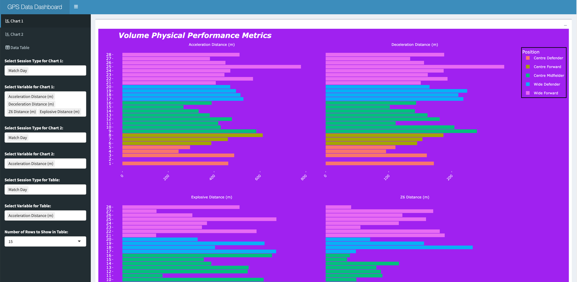
title = "Volume Physical Performance Metrics", # Define the chart title
subtitle = "Physical outputs of each player for the selected day & variable", # Define the chart subtitle
caption = "Use this chart to view the total outputs") # Define the chart caption
})
output$chart2 <- renderPlotly({ # Render the second chart with plotly
plot_gps_data(gps_data, session = input$session_type2, metric = input$variable2, # Call the plot function with the user inputs
title = "Intensity Physical Performance Metrics",
subtitle = "Physical outputs of each player for the selected day & variable",
caption = "Use this chart to view the per minute outputs") })
# Generate the styled data table with sorting, filtering, and row selection enabled
output$styled_table <- renderDataTable({
gps_data %>%
select(-total_time) %>% # Remove total_time column
# Relocate 'player_max_speed' and 'player_sprint_threshold' after the 'value' column
relocate(player_max_speed, player_sprint_threshold, .before = player_position) %>%
filter(session_type %in% input$session_type5, variable %in% input$variable5) %>%
# Rename columns
rename("Player ID" = pid, "Session Type" = session_type, "Variable" = variable, "Value" = value,
"Player Position" = player_position, "Max Speed (m/s)" = player_max_speed, "Sprint Threshold (m/s)" = player_sprint_threshold) %>%
datatable( # Render the data table
options = list( # Define the data table options
pageLength = as.numeric(input$rows_per_page), # Number of rows per page
autoWidth = TRUE,
searching = TRUE,
ordering = TRUE,
dom = 'ftip', # Add the search bar, table, information, and pagination
columnDefs = list(list(className = 'dt-center', targets = "_all")) # Centre align columns
),
rownames = FALSE, # Remove row names
class = 'display', # Apply display class to match the theme
style = "bootstrap4") # Apply the Bootstrap 4 style to the table
})
}
# Run the application locally
shinyApp(ui = ui, server = server)
Explanation:
renderPlotly(): Generates plotly plots based on user input.renderDataTable(): Creates an interactive data table.filter(): Filters the data based on user inputs.select(),relocate(),rename(): Modify the data frame for presentation.datatable(): Configures and renders the data table with interactive features.shinyApp(): Combines the UI and server logic to run the Shiny app.
Step 4: Deploying the Application to Shinyapps.io
4.1 Create a Shinyapps.io Account
- Go to shinyapps.io and create a free account.
- Once signed up, you will need to configure deployment.
4.2 Install and Configure rsconnect
Configure Your Account:In RStudio, load the rsconnect package and set your account information:
library(rsconnect)
rsconnect::setAccountInfo(name='YOUR_ACCOUNT_NAME', token='YOUR_TOKEN', secret='YOUR_SECRET')
Replace 'YOUR_ACCOUNT_NAME', 'YOUR_TOKEN', and 'YOUR_SECRET' with your Shinyapps.io credentials found on the dashboard.
Install rsconnect:
install.packages("rsconnect")
4.3 Deploy Your App
- After deployment, Shinyapps.io provides a URL where your app can be accessed.
Use the following command to deploy your application:
rsconnect::deployApp('path/to/your/app')
Ensure 'path/to/your/app' points to the directory containing your app.R file.
Step 5: Enhancing the Application
5.1 Implement Error Handling
Add error handling to ensure the app can manage unexpected issues, such as missing data or incorrect inputs.
5.2 Optimize Performance
For large datasets, consider using reactive expressions and data caching to improve app performance. Reactive expressions help manage and optimize data processing in Shiny.
5.3 Improve User Experience
- Interactivity: Add more interactive elements, such as sliders or check-boxes.
- Guidance: Provide tool-tips or instructional text to help users understand the functionality.
5.4 Data Refresh
If your data updates frequently, set up a mechanism to refresh it periodically. You can use scheduled tasks or automated scripts to ensure your data stays up-to-date.
5.5 Customize Styling
- CSS: For advanced styling, consider using a custom CSS file to enhance the appearance of your app.
- Branding: Apply specific colour schemes or branding elements to match organizational requirements.
Conclusion
This comprehensive guide provides detailed explanations of each section of the code and additional steps to improve and deploy your Shiny application. Each step is designed to ensure you understand how to build, customize, and deploy a Shiny app effectively. By following this guide, you have learned to build a Shiny application from scratch, encompassing several key components:
1. Setting Up Your Development Environment
We began by installing R, RStudio, and the necessary R packages. Understanding the role of each package is crucial:
- Shiny: Facilitates building interactive web applications.
- shiny-dashboard: Provides tools for creating dashboard layouts and UI elements.
- readr: Assists in reading data from CSV files.
- tidyverse: A collection of packages for data manipulation and visualization.
- ggplot2: Creates static graphics.
- plotly: Converts static plots into interactive charts.
- DT: Renders interactive data tables.
2. Preparing Your Data
Before diving into coding, ensure your data is well-structured and accessible. Proper data preparation is essential for accurate visualization and interaction. In our example, the dataset gps_data_pivot.csv was used, which contained various metrics related to player performance during sessions.
3. Building the Shiny Application
The core of your Shiny app involves writing the application script, which includes several sections:
3.1 Plot Function
The plot_gps_data function was developed to generate customizable plots based on user input. This function uses ggplot2 for creating static plots and plotly for interactivity. Understanding the components of this function, such as ggplot(), geom_col(), theme(), and facet_wrap(), helps you customize plots according to your data and requirements.
3.2 UI Layout
The user interface (UI) defines how users interact with the application. Using shinydashboard components like dashboardPage(), dashboardHeader(), dashboardSidebar(), and dashboardBody(), we structured the app to include tabs for charts and data tables, and drop-down menus for selecting different parameters. This set-up allows users to interact with the data dynamically.
3.3 Server Logic
The server function processes user inputs and updates outputs. We used renderPlotly() to create interactive plots and renderDataTable() to generate a styled data table. Reactive programming principles in Shiny ensure that the app responds to user inputs efficiently and updates the outputs accordingly.
4. Deploying the Application
Deploying your Shiny app on Shinyapps.io makes it accessible from anywhere via a web browser. We walked through:
- Creating a Shinyapps.io account.
- Installing and configuring the
rsconnectpackage. - Deploying the app using
deployApp().
This step is crucial for sharing your app with others and allowing it to run on a cloud server.
5. Enhancing the Application
Improvements can be made to ensure better performance, user experience, and customization:
- Error Handling: Implement error handling to manage issues like missing data or invalid inputs gracefully.
- Performance Optimization: Use reactive expressions to optimize performance, especially with large datasets.
- User Experience: Add interactivity such as sliders or check-boxes to enhance user engagement. Provide tool-tips or instructions to help users understand how to interact with the app.
- Data Refresh: Automate data updates to keep the information current.
- Styling: Customize the app's appearance with CSS for a professional look and feel. Adjust the branding to match organizational themes.
Key Takeaways
- Understanding Shiny Components: Familiarize yourself with Shiny's core components (
ui,server, andoutput) and how they interact. - Customizing Visualizations: Learn to use
ggplot2andplotlyto create informative and interactive visualizations. - Interactive Elements: Implement user inputs and outputs effectively to build interactive applications.
- Deployment: Ensure your app is deployed properly for easy access and sharing.
Further Reading and Resources
To deepen your understanding and expand your Shiny app capabilities, consider exploring the following resources:
- Shiny Documentation: Comprehensive guide to Shiny's features and functionalities.
- shiny-dashboard Documentation: Learn more about creating dashboards with Shiny.
- ggplot2 Documentation: Explore advanced plotting techniques.
- plotly Documentation: Enhance your plots with interactive features.
- DT Documentation: Create and style interactive data tables.
By leveraging these tools and techniques, you can create sophisticated and user-friendly Shiny applications that effectively present and analyse data. Happy learning.
If you have any questions, feel free to ask! Please also offer some feedback on how this can be improved, I have no doubt this will go through many iterations before I'm happy with the final product but this is a nice start.